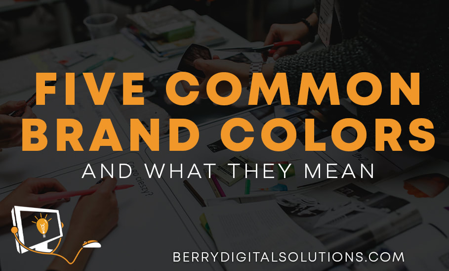
 We all know that color plays a big role in the way people perceive a brand, whether they realize it or not. Color, and the psychology behind it, have been used for many years as a way to get people to do certain things, shop certain places, eat certain foods and more. Let’s talk about the ways color does the talking for you and what it is saying. We will also show some color combos and how pairings of colors can even further relay the message.
1. Blue Blue is often seen as a peaceful, calm, stable and trustworthy color. This color often reminds people of the sea or the sky. Be careful though because it can also remind people of sadness and coldness. If your brand uses a lighter shade of blue, it can signify innocence and openness. Darker shades of blue often represent professionalism and make people feel like the brand is mature and trustworthy. This color is often a background player and is best paired with a bright attention-grabbing color. 2. Red Red is one of the most intense and captivating colors. It drives action and captures attention. It is often associated with excitement, passion, danger, action, and energy. It can provoke strong emotions both positive and negative, so it needs to be used carefully. On a website it is often used as a call to action getting people to click a button, notice a sale, or just learn more about a product. Using the color red is one of the fastest ways to grab attention! 3. Yellow Yellow is closely associated with sunshine. It gives people the feeling of happiness, optimism, positivity, and warmth. Using the color yellow within your core brand colors is a great way to show that interacting with your business is going to be a positive experience for the consumer. This bright, vibrant color grabs attention in a way that red fails to. People are drawn to its positivity and it can impact the way people interact with your brand. It is one of the easiest colors to visibly see and is the first color infants respond to! 4. Orange Orange is another amazing attention attracting color. It often gives the feeling of creativity, adventure, enthusiasm, and success. While not as commanding as red, it is still used often as a call to action color on websites. The energy that orange creates gets people excited about your brand and gets their curiosity flowing. It has also been shown to stimulate appetite which makes it a great brand color for restaurants! 5. Green Green is very connected to nature. It gives people the thought of growth, health, nature, and serenity. Often used within brands that are connected to nature or health in some way, green is a great color to ground people with. It makes them feel like they are connected to nature and that your brand is as well. The only negative connection people make with green is a sense of greed or envy, so be mindful when choosing the correct shade for your business. No matter what color you choose to go with it is also important to have secondary and background colors that pair well together. Your main color will be the color that effects customers most directly, but you can use these ideas about color theory to pair elements together and use color to your advantage. There is so much more to learn about colors and how they are used in marketing, but we hope this gives you a good starting point when thinking about branding your business. |
Archives
May 2024

Categories
All
|
 RSS Feed

|